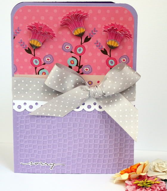
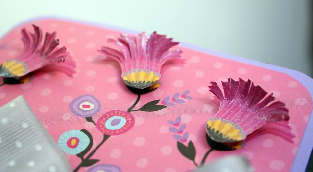
First up is a "Sorry" Card. I used an embossing folder and my Epic Six to deboss (I just flipped the embossing folder) the bottom of the card. I layered the flowers, the flower tops were cut into strips first and then painted with pixie dust blingz. I wrote the sentiment, then cut it out and painted it with pixie dust blingz as well.
 here's a close-up of the flowers
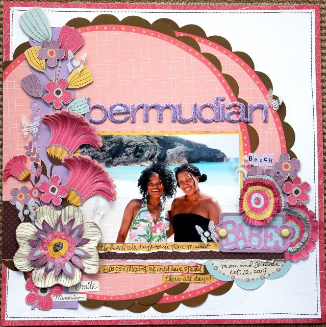
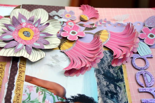
 This next layout is one of my latest favorites!! This is a photo of my mom and I taken last month in Bermuda. I went super duper girly on this one and I love it! I think my mom (who has since been converted into a scrapper) will, too!
 I got a little creative with the transparent overlay. Instead of cutting out the images, I used my butterfly punch and the results are beautiful little one-of-a-kind embellishments for my page.
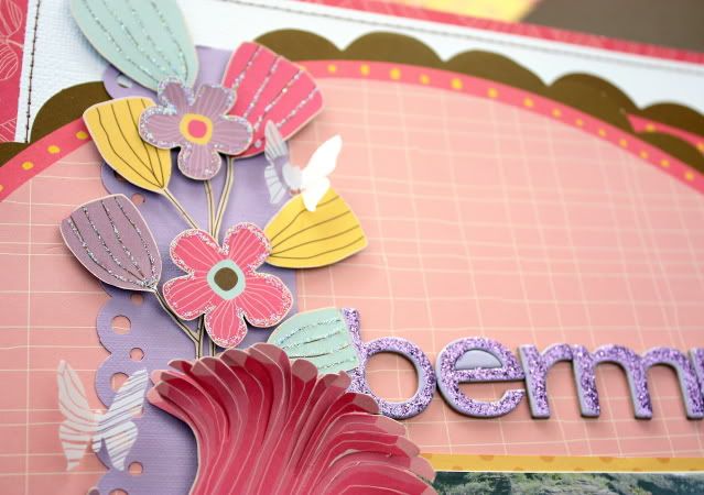 There was a lot of hand cutting going on for this page! My cutter bees got quite the work-out! So did my stickles! I crumpled most of the flowers and layered them using pop dots for added dimension. I also cut fringes in some of the flowers for that extra "touch me" appeal.
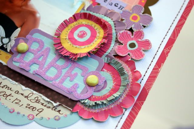
 I really love these glazed alpha (see the word "babes"). They are an ingenious little invention that add the look of glitter without all of the mess.
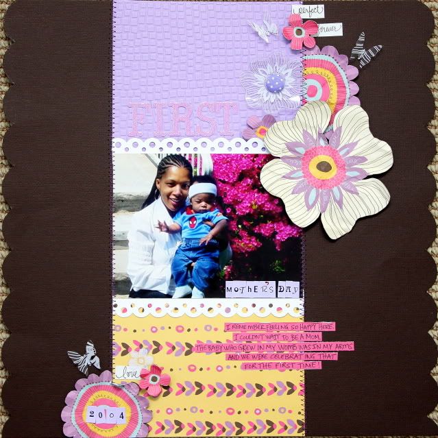
The photo on this next layout is so close to my heart. Troy took this picture of Donovan and I on my very first Mother's Day. Donovan was about 3 1/2 months old in this picture. I remembered feeling so happy that day. I couldn't wait to become a mom!
I must have been in an embossing state of mind because I used it here, too. Hand cutting, stitching, scalloped borders give this layout all right finishing touches. One of the elements about My Little Shoebox papers that I love most, is the fact the there are always images large enough to cut out and make into personalized embellishments.
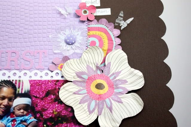
 Here you can get a closer look at the butterflies that I punched from the overlay, the scalloped edges and the hand cut flowers.
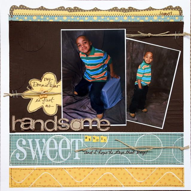
 To create this next layout, I took on a dual challenge. Suzy challenged the DT to scraplift one of DT member's, Michelle L.'s layouts seen here. Instead of actually scraplifting the layout, I took some elements from Michelle's layout titled "Oh So Happy" and used it to create my own version. I loved her color blocking and stitching and how the white background made the elements pop--these are the elements that I incorporated here.
I also challenged myself to create a masculine layout using this uber feminine line. I didn't want to use pink or lavender, nor flowers of any type. Sounds hard right? It was my way of showing MLS consumers how versatile these papers can be, even if you don't think so at first sight.
So how did I do?
I took the blue and yellow patterned papers and cut strips from them. Since I was only working with 2 of the 6 different papers in this line, I had to really put on my thinking cap. I decided to add lots of texture! I cut shapes from the patterned papers and sanded around the edged before adhering them to my strips.
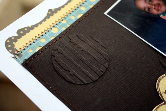
I did something similar to the brown cardstock. Instead of sanding the circles, I ran them through my embossing machine and then adhered them to the cardstock. I love the added texture!
I cut the artisan die cuts in half and layered them across the top. I used a border punch on the small blue strip to make it look like a blue/yellow piece of patterned paper and then stitched it across the edge.
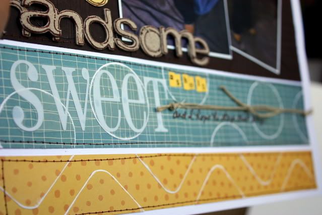
I used twine to create a visual triangle and add texture. The chipboard letters were originally lavender, but that didn't present a problem. I just peeled off the top layer (one of the great things about chipboard) to reveal the raw texture and outlined them.
Looking at the previous 3 projects, one would never guess that this project was created from the same line!
 here's a close-up of the textured tone on tone circles
 ...and a close-up of the chipboard, originally lavender as well as the sanded tone on tone shapes.
Take care!
Don't forget to check out Purple Cows contest. There are still about 5 weeks left to enter! For more information check out this post! There are $9000 in prizes up for grabs!!!






16 comments:
oh, these are all so very pretty!!!
great detail work:)
You are so amazingly talented!!
You've been busy, girl!!! :) Gorgeous work!
OMG so mcuh yumminess here.. not sure i can absorb them all! might have to come again and again to stare!!
tell your mom I said HI!
Wahoo! thanks so much Tanisha! I cannot email you using the link on the blog because I don't have outlook! I will pm you on serendipity
Those colors are so pretty!
Loving you work!! your cut work is fantastic :)
Look forward in working with you in 2010.
xx
your layouts are awe inspiring
These are GORGEOUS!!!! Love all the cut work, the overlay butterflies, the bling! Absolutely awesome!!!
You certainly captured the essence of the bloom papers. I was wondering how your trip was. LOVE that pic of you and your MOM. FAB, FAB work, Tanisha. Love every single detail.
Tanisha, Wow! The colours and flowers, transparent butterflys, the textures and dimensions on your card and pages. Great job. So satisfying for you!!!!
Such amazing layouts! Beautiful! Exactly the reason I follow your blog! Thanks for sharing and inspiring me!
wow so wow!!!!!!!! i like twice these collections from MLSB since i've seen your creations!! (sorry for my english... i'm french canadian!!) thanks for inspiration!!
Ok, so I'm seeing this kinda late I guess...but Lordie, Lordie Girl!!! YOU ROCKED IT! LOVE to come and see what you've been doing! Such an inspiration! LOVE LOVE LOVE those flowers and butterflies!!
I love your work Tanisha! And the layout with your mom in bermuda brings back some fond memories!
Hope your Christmas is wonderful!
xo
These are amazing!!
Post a Comment