 Here's my take on the ad. I used the colors (brown, black, and trace of red), the distressed look, and the layering as inspiration.
I took this photo of Donovan last Summer and had no idea how to scrap it. I like the outcome, plus I finally had the opportunity to test out some Graphic 45 papers!! They work well with the Jenni Bowlin papers here!
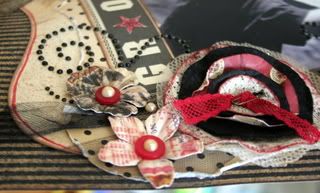
 Now for the deets! I took apart the lollipop flower and replaced one of the circles with a piece of red patterned paper. I then cut a piece of gauze (my non scrappy item) into a circle, spritzed it with glimmer mist and added it to the back of the flower. I coupled the safety pin with a piece of savvynsassy lace to finish off the center.
I added Kaiser pearls (can't get enough of these) to buttons and used them as centers for the smaller paper flowers.
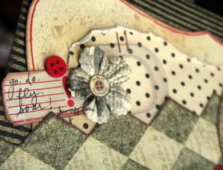
 I spritzed the JB die cut paper with sandy beach glimmer mist and outlined with a red pen, then added simple journaling and an acetate "D".


8 comments:
Tanisha, your layout is just such a fantastic take on the ad, I just love it!!! I am so excited to be part of you wonderful ladies!
Very clever to use the gauze!
awesome layout!
What a wonderful interpretation of the ad. I like that you used feminine elements in your LO (like the flowers & the flourishes) yet the LO does not look girly.
love your new banner and avatar!
your layout is gorgeous!
love your new banner and avatar!
your layout is gorgeous!
Girl, you are still rockin that scrapbooking, huh? I am SOOOO jealous! I just can't seem to get my flow back! I think I'm gonna do an Obama scrapbook. That's inspiring, HUH?? LOL
By the way, did I ever tell you that your blog title inspired me to do a LO of my Jayla? I walked past her room one day and she was "talking" on one of our old cell phones. And as I walked by, she said, "Girl, Lemme tell ya!" Too cute! I'll have to show it to you one day.
Take care and enjoy your week.
I love your take on this week's challenge. Great job and love that photo.
Post a Comment